Every generation has its cultural shorthand, a symbol that carries meaning far beyond its simple form. For some, it’s a band logo or a sports emblem. For me, it was always the Cool S—that six-line doodle passed from notebook to notebook, hallway to hallway, without any instruction or explanation. It was a symbol we all knew instinctively, as if it were encoded in the very DNA of growing up. Years later, when I set out to design my author logo under the name Jaime David, I found myself coming back to that same symbol, not because of its shape alone, but because of what it represented: creativity, resilience, and a universal sense of belonging.
The Cool S wasn’t just a doodle—it was a spark of artistic freedom in the margins of our lives. In classrooms filled with rules and structure, where every line we wrote was graded and every answer measured against a key, the Cool S was different. It was art without judgment, something you drew not to impress but to express. It gave every child the chance to feel like an artist, even if they never touched a paintbrush. That democratic spirit of creation—the idea that something simple, accessible, and shared could hold real meaning—inspired me as I considered what my own logo should stand for.
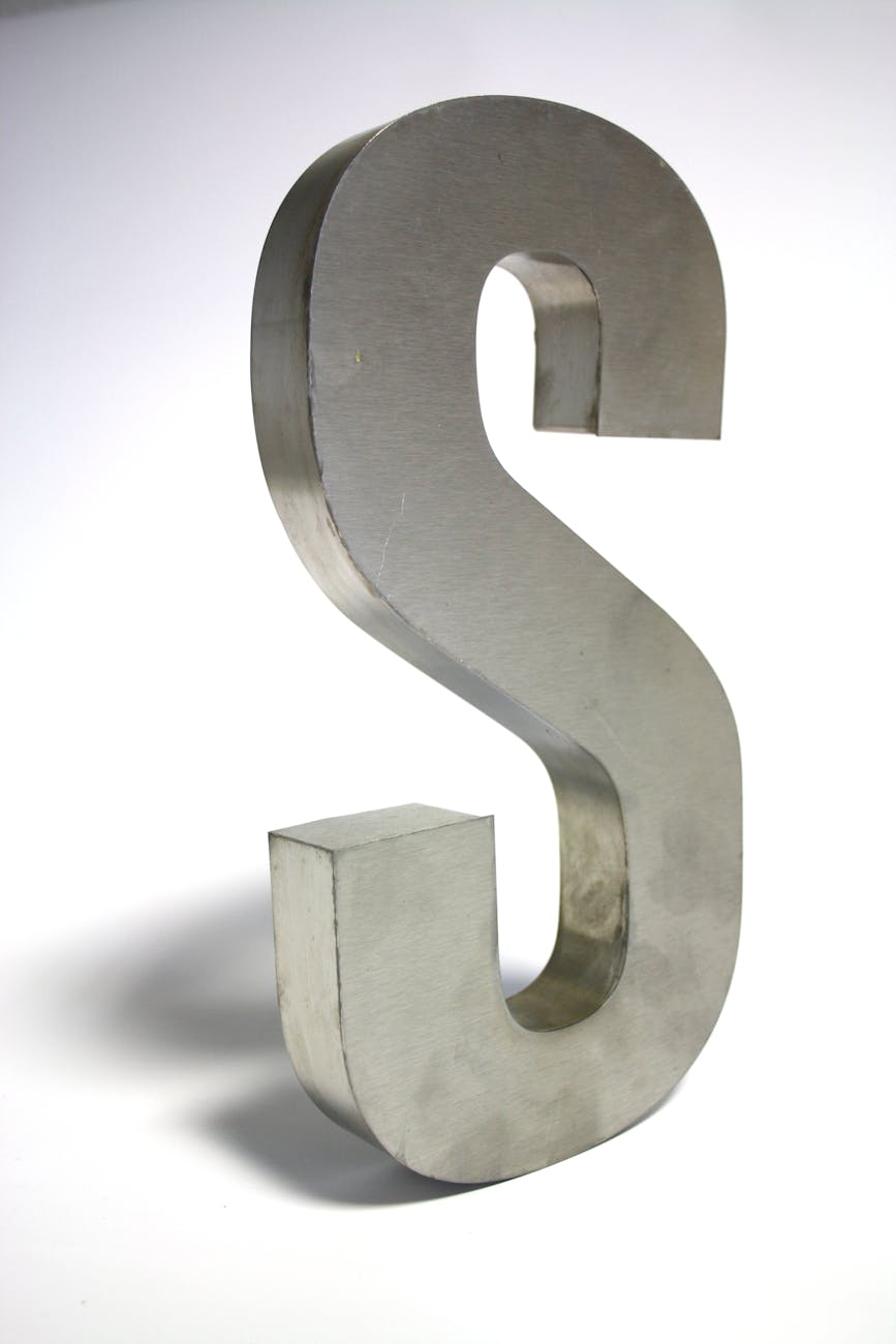
When I first drafted ideas for the Jaime David logo, I didn’t want just a stylish graphic. I wanted a symbol that carried weight, something that reflected both my identity as a writer and the collective imagination that stories come from. That’s when the Cool S came to mind. Its sharp edges, clean lines, and bold symmetry have a timeless quality. More importantly, it spoke to the essence of what I hope to achieve with my writing: taking something ordinary, a set of lines or words, and transforming it into something greater.
The Cool S was always about transformation. Six parallel lines on their own mean nothing, but when connected with just the right strokes, they become something recognizable, almost iconic. That process mirrors writing itself. A story begins with scattered words and ideas. On their own, they are fragments. But with careful shaping and connection, they form a narrative that resonates. In that way, the Cool S became more than just childhood nostalgia for me—it became a design philosophy, a reminder of how creativity takes shape.
There’s also an element of mystery to the Cool S. No one really knows where it started or who invented it. It spread across the world without the internet, long before memes and hashtags could propel something into global consciousness. That sense of origin-less universality fascinated me. As an author, I want my work to feel like it belongs not just to me, but to everyone who reads it—to carry a spark that feels familiar yet still personal. Incorporating the essence of the Cool S into my logo was my way of honoring that universality.
When you look at my Jaime David author logo, you might not immediately recognize the Cool S influence. It isn’t a direct copy; rather, it’s a reimagining. The geometry, the symmetry, and the sense of balance are there, but shaped into something new. It’s the spirit of the Cool S translated into a professional emblem—less of a doodle in the margins, more of a signature on the page. It connects the playful creativity of my past with the purposeful storytelling of my present.
Ultimately, the Cool S reminds me that art doesn’t need permission to exist. It doesn’t need a single inventor or a perfect backstory. It just needs to resonate. That’s the philosophy behind my logo, and, in many ways, my writing itself. I want my words to be accessible, to reach people regardless of where they come from, and to spark something familiar yet transformative.
So while the Cool S may forever live in the margins of school notebooks and the walls of forgotten classrooms, for me, it has found a new home in my author identity. It stands not just as a relic of childhood rebellion but as a lasting inspiration for creative expression. And every time I see my logo, I’m reminded that even the simplest shapes—like the Cool S—can carry the deepest meaning.